One might say, well that is what critique is for. Anyone who follows me know that I am vehemently anti-critique. Here’s the way I see it: critiques help on a case by case basis. They do not help systemic failure in art. They’ll help you make one piece better, but what about the next piece. What if that person who gave you a great critique isn’t there to help you a second time? How do we improve systemically so that we consistently produce the work we want to produce?
I’ve seen plenty of tutorials focusing on techniques in art; painting and what not, but with this tutorial/essay I mostly want to focus on how I think we should approach getting better. Better being a subjective term. Some people want to draw like Joe Madureira, others want to draw like Kentaro Muira, and yet others want to sculpt like Bernini. Everyone has their own visual style that they want to aspire to and their own tastes for what they consider good and bad.
So throughout this tutorial, I’m trying to move to what I think is good, not what is objectively good and I’m only going to focus on one specific aspect of my work, inking.
Over the past four days I’ve done several works involving the same character, but each one is more different than the last. The main reason was I was refining how I draw the character, and my process of inking. With this I’m talking JUST about inking. But I used this approach with how I drew her as well. You’ll note that the way she’s drawn in the final two pieces is very similar because I felt that I was heading in the right direction. But if you compare the first piece and the last piece they are night and day.
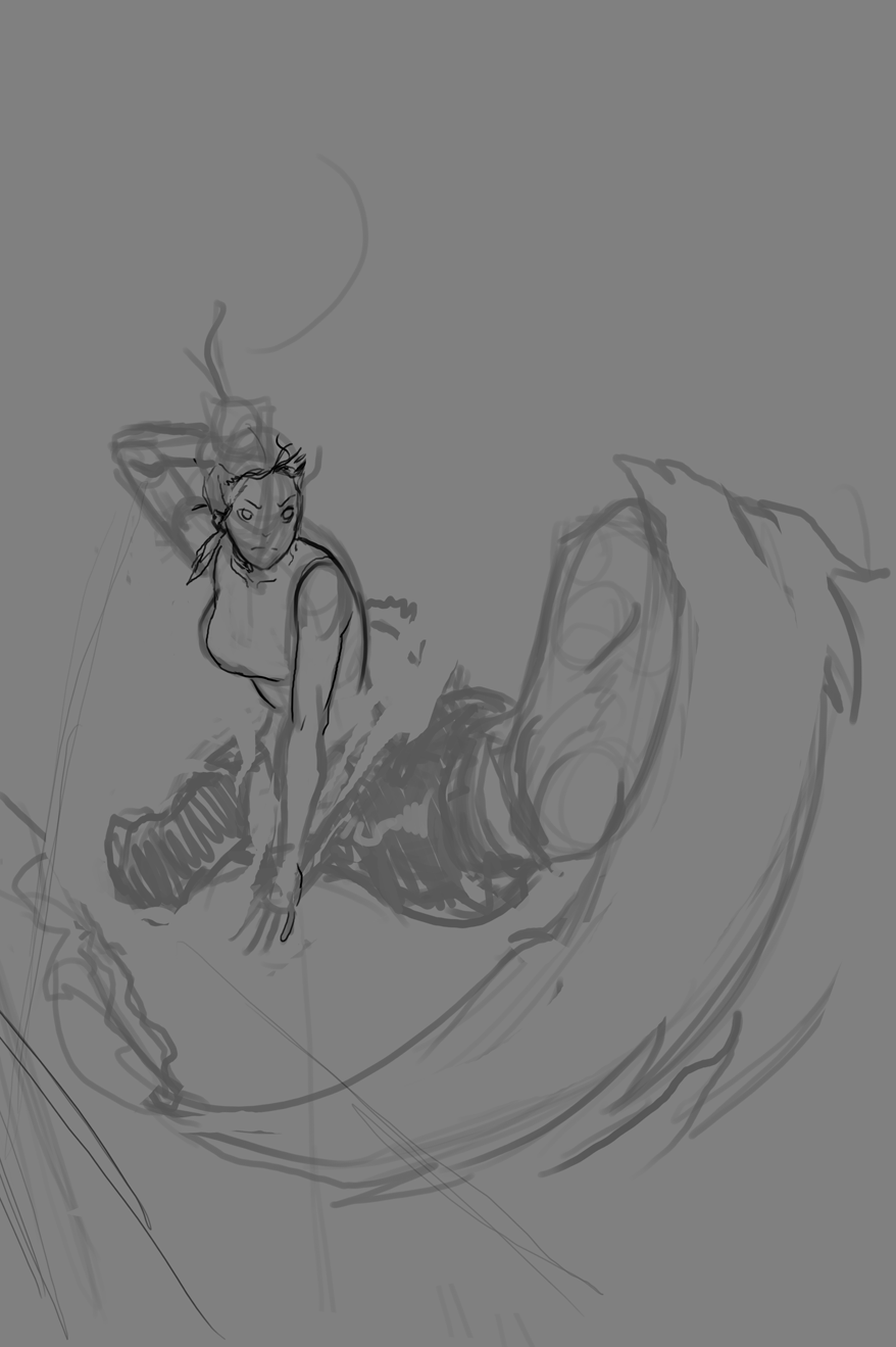
Now let’s look at the sketch next to the ink next to the final of the first piece.

My approach: I inked this in photoshop using the pencil tool set far thicker than it needed to be at maximum pressure, and far thinner than it needed to be at minimum. The idea was that each line was supposed to be done in one fell swoop. I then took the inks in to Adobe Illustrator and live traced them. I loaded that .ai file in to photoshop at the enormous size of 22inches wide with aliasing turned off. I then colored it using the paintbucket tool, using the pencil tool to close off gaps when necessary. All that was left was rendering and I was done.
Why I approached it that way: First I used the pencil tool because I knew I would be taking it in to illustrator. The pencil tool was set the way it was because I was going for a brush like feeling. The idea was that I could get whatever lineweight I needed without switching sizes. Now, I took it in to illustrator because at makes the line crisp, gets rid of any “warblyness” and when I import it without anti-aliasing I can make it so huge that aliasing is irrelevant. This allows for very quick and very easy coloring. None of that “use the lasso tool to select an area” BS. Because if you use the fill tool on a circle that is anti-aliased you’ll get a halo effect, if you use the fill tool on something that isn’t anti-aliased you won’t get that halo effect.
What failed in that approach: I attempted to be extremely precise with each stroke, trying to do each one in “one fell swoop.” However, in attempting to be precise, I was actually far more timid about my strokes. My lack of confidence while trying to be precise also affected the amount of pressure I put on each stroke. So what you get are timid lines of random thickness. Those lines don’t help the final piece at all. They’re overpowering in their presence. For the aesthetic that I’m shooting for, the linework shouldn’t be that dominant.
Now, with this knowledge, I went on to my next piece.
Here is the sketch next to the ink next to the final.

My approach: I approached this similarly to the first one except I altered the tool slightly. I used several sizes of pencil tool that had a small maximum pressure, and a very very small minimum pressure. I also attempted to be far more confident on my line work. If I overshot a line, I just erased it the excess and kept moving forward.
Why I approached it that way: After the first one, I realized that I do not have the control for that kind of an inking tool. I also attempted to be much more confident since it was the lack of confidence that ruined my last piece.
What failed: While this is an improvement, it still suffers from random thickness and timid lines. Additionally, there are an excess of lines where there shouldn’t be, and a lack of lines where there should. For example, look at her hands. Without the line to expressly delineate each finger, it looks like her hands are webbed, yet at the same time there are detail lines all over her clothing. It feels… sloppy.
Now, with this knowledge, I went on to my next piece.
Here is the sketch next to the ink next to the final.

My approach: With my last two images I started with a sketch in photoshop. I decided to start this one with a sketch on paper. I also inked this in paint tool sai. One of the things about inking in photoshop is that if I zoom out to ink the line tends to take on a stair like property if it is curved. Now this isn’t aliasing, the actually line looks like stairs. It’s really weird. However, after a friend suggested that I use it, I found out that that stair like effect doesn’t happen. I inked using a very small brush size, something like 2 or 3, with 0% minimum pressure. In addition to being confident with my strokes, I also attempted to be clean and completionist. No webbed fingers. No random detail lines.
Why I approached it that way: With the last one, I felt that my lines were still too thick, too warbly. Also, I’m really shooting for a minimilast aesthetic when it comes to my line work. Having choose to thickly before, I decided that if I were to make a mistake it this time it would be to make it too thin.
What failed: Sadly, it was too thin. When I attempted to livetrace this in illustrator, half of the line work disappeared. When I lowered the minimum area it would trace, it actually trace the aliasing. This meant that no matter what size I attempted to load it in photoshop, it always looked really aliased. However, this was the
Now, with this knowledge, I went on to my next piece.
Here is the sketch next to the ink next to the final.

My approach: After the last one I made a decision. No livetrace. It would make coloring harder, but I decided that it caused more problems than it fixed. It randomly thickened and thinned the lines. I also doubled the size of the inking tool in Paint Tool Sai and made the minimum pressure 50%.
Why I approached it that way: Since my goal was better linework not easier coloring, I decided to sacrifice one for the other. Every once in a while, we have to assume that a step that we take is fundamentally wrong. By putting my linework in the hands of an algorithm I was losing a bit of control. While the result was sometimes pleasing, it always had a certain amature look to it. So I decided to not rely on my crutch.
What failed: Well, what I was afraid of happening, happened. The coloring was much harder, but the lines were also far more “warbly” despite my attempts at confident strokes. Also the lines, don’t suggest any kind of a light source, or they suggest a conflicting light source.
All in all, the final is by far the best piece in terms of inking. Now here is how I did that.
First, have intent. Don’t just do shit randomly. If you’re looking to get better at coloring, have a plan for how you’re going to color.
Second, have a reason for that intent. If you’re using a gradient, ask yourself why you are using that gradient.
Third, be honest with yourself and analyze what didn’t work about your approach. If that gradient feels lazy or doesn’t work, ask yourself why it doesn’t work. This is a very subjective thing. Most of the time, you won’t realize what you did wrong until much much later. That’s how it is for me most of the time. It only worked quickly for me in this situation because I’m just so terribad at inking that any step forward is a huge step. With coloring or painting, my progress is much slower.
Fourth, change your approach if you need to. If you aren’t satisfied with how you are doing something STOP DOING IT.
Finally, take time to enjoy your work when you feel you’ve had a success. This entire tutorial has been about tearing apart your own work, and that’s really important, but after a while you’ll begin to hate everything you do. No matter how good you are, there were always be a flaw in your approach that you can work on. If what you’ve made is the best you could have made at that moment, be proud of it.
Anyway, that’s how I approach getting better.




 Posts
Posts


